Are you looking at a Gatling Test Report for the first time and feeling overwhelmed? Or perhaps you’ve been using it for a while without really understanding everything on there? Welcome! Let’s take a closer look at what it all means together!
The Importance of Good Data
So, we have a web application and wish to know how it performs under a certain workload. Enter Gatling! The enabler of our desire to exert undue pressure on (hopefully not unsuspecting) systems.
In the grander scheme of Performance Testing, the details of how we write our simulation code, whether that be as cleanly implemented pieces of ingenuity or held together by bits of tape, are not so important.*
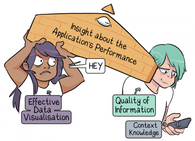
What matters from a testing perspective is, instead, the quality of the information we receive. We need data in order to analyze and evaluate performance, and this is where reports come in.
*I mean, it still IS essential, of course. For maintainability reasons, for a start, but it’s arguably a lot less critical than test design and data analysis when it comes to making statements about the system under test.
Gatling is a Tool
Gatling takes measurements, records timings, and presents us with information in a useful way. We might read these reports and use the information to adjust our testing strategy. Reading reports and writing tests can be relatively closely coupled, mainly if we use Gatling to measure responses under normal circumstances before ramping up the pressure.
However, it’s important to remember that Gatling is a tool and cannot, for example, identify whether our simulation includes business-critical scenarios or context-appropriate assertions.

Our report does not exactly represent our application’s behavior. The accuracy is, and can only be, dependent on how well we designed our tests. Which paths through the system we included. How realistic the test data was. How representative the load we simulated is.
If our simulation or tests are lacking, the report will still look lovely but won’t give us an accurate reading of system behavior. In other words, Garbage In, Garbage Out.
Let us continue, then, working under the assumption that our simulation and tests are reasonably sensible, and the sticking point is understanding what our report is telling us about our application!
What on earth does it all mean?
Being presented with all of this (useful, wonderful) data all in one go can be a little overwhelming, at first. If you’re feeling flustered, take a moment to breathe. You’re in the right place because we’re going to break the report down and go through it together.
 The centerpiece of our report is, of course, the data itself. However, it’s very rare for humans to make interesting inferences simply from reading abstract numerical data. Gatling knows this, which is why their reports also have a large visual component.
So we have our tabular data and various graphical representations. All the other tabs and sections help us narrow our focus by filtering the data to show us smaller subsets (detailed views).
The Report, in numbers
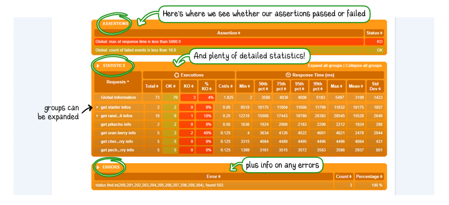
Assertions
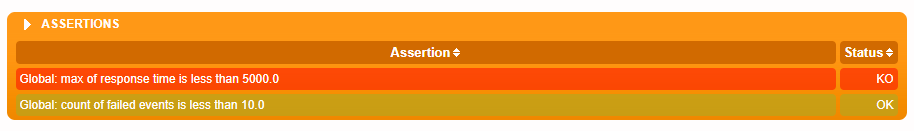
- Assertion: Our assertions are listed in nice, readable sentences
- Status: Whether our assertion passed (OK) or failed (KO)
Statistics
Requests
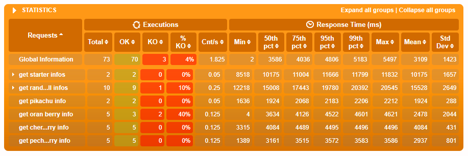
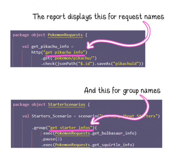
- All requests, or groups of requests that were executed as part of our simulation are listed here. We can click on groups to see the requests contained therein.
Wondering where the report pulls the request and group names from?
Executions
- Total: Total times the event* was executed
- OK: Successful events
- KO: Failed events
- % KO: Percentage of failed events
- Cnt/s: Count of events per second
*Event can refer to either a single request or a group of requests
Response Time
- Min: The fastest response time
- Percentiles: How the response time compares with others*
- Max: The slowest response time
- Mean: The average response time.
- StdDev: How far the response times vary from the average*
*Percentiles and Standard Deviation are worth taking a closer look at; more on that later
Errors
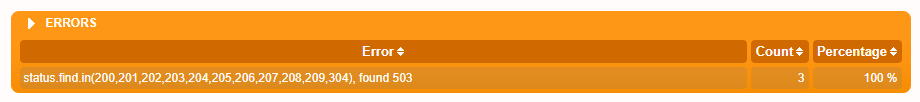
- Error: The error itself (e.g., 500 HTTP response, timeout exception…)
- Count: How often the error occurred
- Percentage: The percentage of this error comprised of errors overall
Why Averages are misleading
 When faced with so many different numbers, it's tempting to hone in on the average response time. But is it enough to say that our customers have a good experience on average?
Let’s consider this result:
- 5 users load our shop within 2 seconds
- 2 users only wait 3 seconds
- 2 users have to wait 5 seconds
- and 1 user has to wait for 8 entire seconds
On average, users waited for 3.4 seconds. That’s great, right?
Perhaps we'd leave it there if we hadn’t just read the breakdown.
If we say that anything over 3 seconds is too slow, then 30% of our users had a bad experience. The average alone cannot tell us that, and under normal circumstances, we won’t be able to see what happened (as in the breakdown above) because we will have data not for ten users but for thousands.
So, what information are we missing? It would be useful to know how similar the other response times are to the average…

Don’t be alarmed, Gatling provides us with this information in the form of Standard Deviation and Percentiles. We don’t need to do the maths ourselves – we need to understand what these values represent.

Standard Deviation
How are the response times spread out from the average?
A low value here indicates that all responses were close to the average, and a high value indicates that they were more spread out.
If we see a high standard deviation, we will know that our application does not respond consistently, the average does not tell the whole story, and it’s time to investigate this erratic behavior.

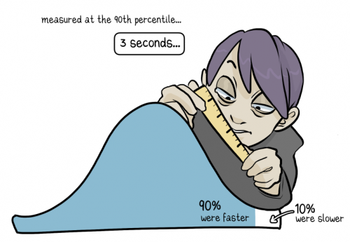
Percentiles
How does a response time compare to all the others?
All of these statements are saying the same thing:
- Measured at the 90th percentile, the response time is 3 seconds.
- A response time of 3 seconds is greater than 90% of all responses.
- 90% of responses were faster than 3 seconds.
- 10% of responses were slower than 3 seconds.
The larger our user base, the closer to the 100th percentile we want to measure. Whether or not a response time of 3 seconds measured at the 99th percentile is adequate will depend on how many end users make up that 1%!
The Report, visually
Our brains process visual data very quickly
Graphical representations of data allow us to identify patterns, trends, and exceptions much more easily than staring at a page of text. It’s no coincidence that Gatling’s reporting is so rich in visual information!
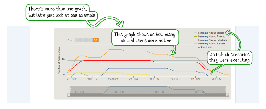
 Gatling presents to us not only the statistical data from the table earlier but additional information that illustrates the simulation and application’s behavior over time.
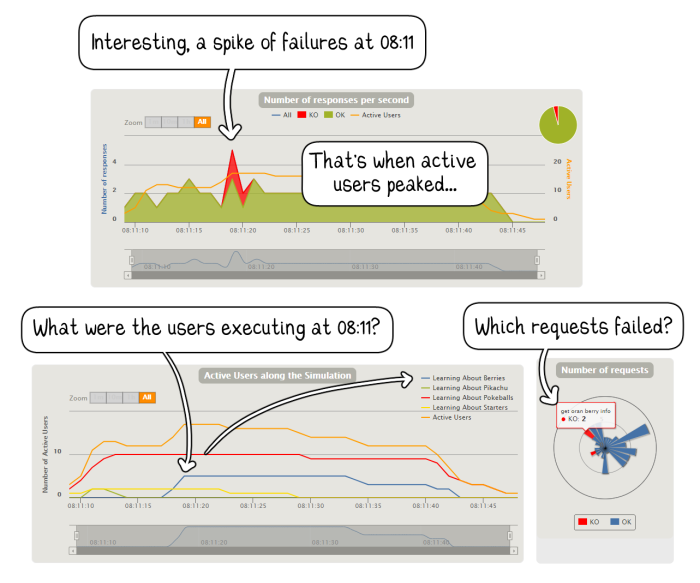
Time Series Data is illuminating
Can we draw any conclusions from knowing there were N failed requests throughout the simulation? It matters when the failures occurred, what else was happening simultaneously, how many users were active at that second or in the seconds before, and so on.
Customizing the Report
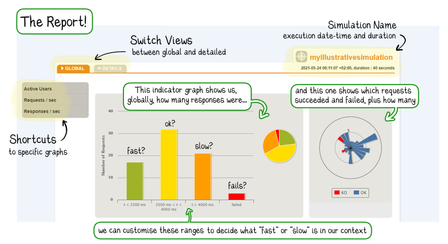
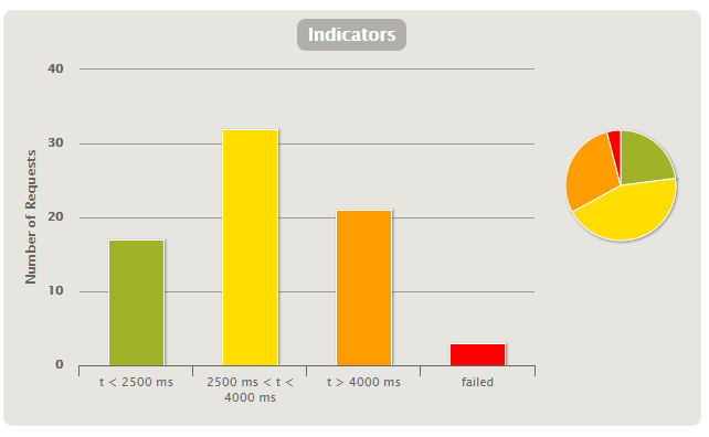
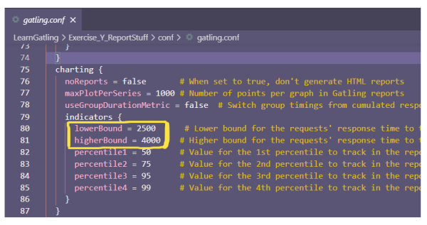
You may have noticed that the Indicators graph uses standard ranges to delineate response times. Looking at this chart and perhaps seeing a very large red bar without being aware of the range boundaries it’s based upon may result in unnecessary alarm.

Why? Acceptable Performance does not look the same in every context or application. There might be contexts where speed is imperative, and any sluggishness might compromise safety somehow. Others are where a more leisurely pace is expected (and even tolerated).
We don’t judge our bicycle journey to the supermarket against the average speed of a participant in the Tour de France! Context is essential for determining whether something was slow.
How do we ensure that the convenient traffic light visual uses acceptable ranges? By changing the values in the gatling.conf file.
Load testing is a means to an end
Why is the report not the end of our performance improvement story?
We are, essentially, engaging in a kind of black-box testing. We send a request and record how long the response takes. What happens inside the application, where precisely in our code or infrastructure, bottlenecks or failures might be? Unknown.
We want to be able to use our report to identify the moment when performance deteriorates. Or at least to give us clues for where to focus our follow-up investigations.
If debugging a performance issue is like a criminal investigation, then our Gatling report would be like CCTV footage of the crime. It doesn’t tell the whole story, but it provides us with vital pointers when we’re deciding how to proceed.

This article was written and illustrated by Constance Armitage, a Test Automation Engineer for Quality Minds.
QM is a young IT company that offers services in the field of QA in agile software development. The team consists of more than 200 experts in software testing and software development, IT architecture, and requirements engineering. They advise customers, offer workshops, and are “hands-on” on IT projects.
Share this

Analyzing gRPC Performance with Gatling on Qdrant Free Tier

The Art Of Destroying Your Web App With Gatling