
Table of contents
Latency percentiles for load testing analysis



Last updated on
Thursday
July
2026
Latency percentiles for load testing analysis
Your average response time looks great. So why are users complaining that the app feels slow?
Here's the catch: an average can be dragged in either direction by a handful of requests, and it tells you nothing about the requests that hurt the most. If 99 requests return in 100 ms and one takes 10 seconds, your average is still under 200 ms, but that one user had a miserable experience. Latency percentiles fix this blind spot. They show you the distribution of response times, so you can see what your slowest users actually feel.
This guide is for the engineers who live in that data every day: performance engineers, SREs, SDETs, and DevOps teams reading load test results. You'll learn what P50, P90, P95, and P99 mean and why averages mislead. You'll also see how Gatling calculates percentiles, which one to pick for an SLO, and how tail latency behaves in distributed systems. If you're new to the topic, start with our primer on what load testing is, then come back here.
Latency percentiles explained
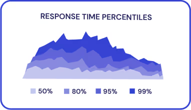
A latency percentile tells you the response time below which a given percentage of requests fall. If your P95 latency is 400 ms, then 95% of requests completed in 400 ms or less, and the slowest 5% took longer.
Percentiles are usually written in "P-notation": P50, P90, P95, P99, and sometimes P99.9. The number after the P is the percentage of requests at or under that response time. Higher percentiles describe the slower end of your distribution, or the part your average tends to hide.
Think of it as sorting every request from fastest to slowest and then walking down the list. The P50 request sits halfway down. The P99 request sits 99% of the way down, with only the worst 1% behind it. Percentiles are the standard way to reason about the shape of latency, not just its center.
What does P90 (90th percentile) latency mean?
P90 latency, or 90th percentile latency, is the response time that 90% of your requests meet or beat. Only the slowest 10% exceed it.
P90 is a useful baseline because it starts to expose the tail while staying stable under load. It answers a practical question: "How slow is the experience for a clear majority of my users, once I set aside the very fastest requests?" If your P90 climbs during a test, a meaningful slice of traffic is degrading, not just a few unlucky outliers.
What is P95 and P99 (95th/99th percentile) latency?
P95 latency is the response time that 95% of requests meet or beat; the slowest 5% are above it. P99 latency, the 99th percentile response time, is the value that 99% of requests fall under, leaving the worst 1% in the tail.
These two are where user pain usually lives. A healthy P50 with a bad P99 means most requests are fine but a small, real group of users is hitting slow responses. On a busy service, "1% of requests" can still be thousands of unhappy people per minute. That's why P95 and P99 are the go-to metrics for user-facing latency.
What about P50 and tail latency?
P50 latency is the median: the response time of the typical request. Half of your requests are faster, half are slower. It's a good read on the common case, but it says nothing about the slow end.
That slow end is the tail latency: the high percentiles (P95, P99, P99.9) where your worst response times live. Tail latency is where timeouts, retries, and frustrated users show up first. Most of this guide is really about reading and taming that tail, because it's the part averages and medians quietly ignore.
Why averages hide your real performance problems
The mean isn't useless — it's a fine input for capacity planning. But on its own, it's a poor description of user experience, because it collapses an entire distribution into a single number and lets a few extremes distort the story.
Google's SRE guidance is blunt about this. In the SRE Book's chapter on service level objectives, the authors write that "most metrics are better thought of as distributions rather than averages," and give an example where "although a typical request is served in about 50 ms, 5% of requests are 20 times slower." The chapter on monitoring distributed systems makes the same point with volume: run a service at 1,000 requests per second with a 100 ms average, and "1% of requests might easily take 5 seconds." The mean hides all of it.
There's a sharper way to say it. In his widely cited talk "How NOT to Measure Latency," Gil Tene argues that watching only the 95th percentile is what you do when you want to hide the bad stuff. He calls the maximum value the signal, not the noise (see also this 2023 write-up of the talk and an earlier Brave New Geek summary). You don't have to go that far to take the lesson: report distributions, and always watch the tail. For a deeper look at how summary statistics can mislead, see our guide to metrics and deviations in load testing analysis.
How percentile latency is calculated
Calculating an exact percentile means keeping every single response time, sorting them, and indexing into the sorted list. That's straightforward for a small run. It stops being practical when you're generating millions of requests, because storing and sorting every raw sample would burn memory and slow the test down.
So Gatling uses a well-known trade-off: it approximates percentiles with a histogram instead of retaining every value. Response times are bucketed as they arrive, and percentiles are computed from the bucket counts. This keeps memory flat regardless of how many requests you fire, and the approximation stays within a bounded error, under 10% of the true value.
Here's the practical detail worth remembering. Response times are recorded as integer milliseconds, so a reported value carries the rounding of its bucket. If Gatling reports a 90th percentile of 8 ms, the true P90 sits somewhere in the range that rounds to that bucket, roughly between 7.5 ms and 8.4999 ms. A quick way to read it:
- The reported percentile is an approximation, not an exact sorted value
- The error is bounded to under 10%, so it's reliable for decisions
- Integer-millisecond rounding means a reported 8 ms represents a 7.5–8.4999 ms range
- The benefit is constant memory use, so you can run massive tests without losing percentile fidelity
The authoritative pattern comes from the Google SRE Book, which recommends collecting "request counts bucketed by latencies (suitable for rendering a histogram), rather than actual latencies" — exactly the histogram approach. For a deeper technical dive, this older but still-useful write-up on measuring percentile latency is worth a read as optional further reading.
A few notes from the SRE Book to guide the choice. A high-order percentile like P99 or P99.9 "shows you a plausible worst-case value," while P50 "emphasizes the typical case." Users also "typically prefer a slightly slower system to one with high variance in response time," so reducing tail variance often matters more than shaving the average. And P99 pulls double duty: measured over a short window, it "can give a very early signal of saturation," so it's a leading indicator of capacity trouble, not just a UX metric.
A reasonable default: track P90 as your baseline, and hold P95 to P99 as targets for user-facing services. Just don't crown any one percentile as the universal answer.
Which percentile should you use?
There's no single "correct" percentile. The right choice depends on what you're trying to protect and which users you care about. Google's SRE guidance is explicit that you shouldn't lean on one threshold alone. The SRE Workbook recommends setting multiple thresholds. For example, "90% of requests are faster than 100 ms, and 99% of requests are faster than 400 ms" — because a single percentile can mask unhappy users in the segment you're not watching.
Use this as a quick reference:
Why tail latency compounds in distributed systems
Tail latency stops being a curiosity and becomes a design problem the moment a request fans out to many servers. This is the central finding of Dean and Barroso's "The Tail at Scale" (Communications of the ACM, 2013): rare slow responses at the component level become common at the request level.
The math is unforgiving. Take a server with a 99th-percentile latency of one second, meaning 1 in 100 requests to it is slow. If a request fans out to 100 such servers in parallel and must wait for all of them, the paper reports that "63% of user requests will take more than one second." That 63% holds only under that precondition — a full 100-way fan-out where each server independently has a 1-in-100 chance of being slow (it's 1 − 0.99¹⁰⁰). Scale up and it gets worse. The authors note that even when only "one in 10,000 requests" is slow at a single server, "a service with 2,000 such servers will see almost one in five user requests taking more than one second."
Real production data tells the same story. Dean and Barroso measured a Google service where the 99th-percentile latency for a single leaf request was 10 ms. Yet the 99th-percentile latency for all requests to finish was 140 ms, with roughly half of that attributable to waiting on the slowest 5% of requests. The lesson: at scale, end-to-end latency is dominated by stragglers, not by any one slow machine.
Common causes of high tail latency
Why do individual servers produce those occasional slow responses in the first place? Dean and Barroso catalog the usual suspects, and most of them are ordinary, healthy behavior rather than bugs:
- Shared resources: applications on the same machine contend for CPU cores, processor caches, memory bandwidth, and network bandwidth
- Background daemons: they use few resources on average but "can generate multi-millisecond hiccups" when scheduled
- Maintenance activities: data reconstruction, log compaction, and periodic JVM garbage collection in garbage-collected languages cause periodic latency spikes
- Queuing: multiple layers of queues in intermediate servers and network switches amplify existing variability
- SSD garbage collection: solid-state drives periodically reclaim data blocks, a hardware-tier spike that's distinct from JVM GC
- Power limits: CPUs throttle when they've run above their power envelope too long, adding latency
A quick clarification, because it trips people up. JVM garbage collection and SSD garbage collection are two different causes. The first is a software maintenance activity in garbage-collected runtimes; the second is a hardware behavior inside the drive. They can both spike your tail, but you address them in completely different ways.
Contention between tenants on shared infrastructure is what many engineers today call the "noisy neighbors" problem. That's a useful modern label; just note it's our phrasing, not Dean and Barroso's; the paper files these under global resource sharing.
Strategies to reduce latency percentiles
Once you can see your tail, you can attack it. Several of the most effective techniques come straight from "The Tail at Scale," and they share a theme the authors state directly: "the most powerful tail-tolerant techniques reduce latency hiccups regardless of root cause." One caveat first. These replica-based methods target read-heavy, loosely consistent workloads. The paper is explicit that mutations to critical state need different handling, so don't apply them blindly to writes.
Hedged requests
Send the request to one server. If the first is still outstanding past its P95 expected latency, send a duplicate to a second server and take whichever returns first. This caps the extra load near 5% while cutting the tail sharply. In a Google BigTable benchmark reading 1,000 keys across 100 servers, hedging after a 10 ms delay dropped the 99.9th-percentile latency from 1,800 ms to 74 ms, while sending just 2% more requests.
Tied requests
Enqueue copies of a request on two servers at once, each tagged with the other's identity. Whichever starts first cancels its twin. Unlike hedged requests, there's no deliberate delay — the copies race from the start. On a file-system replica, tied requests after 1 ms cut median latency by 16% and reached nearly 40% reduction at P99.9.
Micro-partitioning
Slice data into many more partitions than machines, so load balances smoothly and recovery stays fast. BigTable, for instance, keeps 20 to 1,000 tablets per machine.
The unifying idea is simple: issue the same read to multiple replicas and use whichever answers first. You trade a little extra work for a much tighter tail. Just keep the read-heavy scoping in mind, and remember these are 2013 Google benchmarks. Your numbers will differ by architecture and workload.
Reading latency percentiles in Gatling Enterprise
Definitions are one thing; seeing percentiles move in real time as your test ramps is another. Gatling Enterprise gives you a live percentile dashboard so you can watch the distribution evolve while the run is in progress, instead of waiting for a static report at the end.
You get more than a single number. The response-time view lets you toggle across percentiles from the 25th all the way to the 99.99th, so you can inspect the median, the shoulder, and the far tail in one place. You also get the mean, min, and max. That max is exactly the outlier Gil Tene warns against discarding. Watching P99 and P99.99 climb as virtual users ramp is often your clearest early warning of saturation.
From there you can turn observations into guardrails. Pair your percentile data with our SLO Advisor to set thresholds that reflect real user impact, and use the Performance Maturity Analyzer to see where your practice stands and what to improve next. Together they help you move from reading percentiles to acting on them.
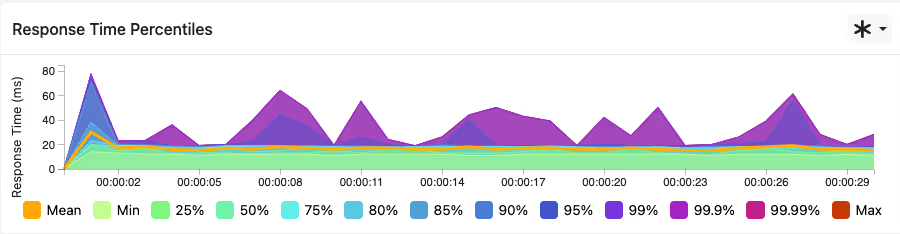
Users of Gatling Enterprise can toggle between all of the percentiles shown in the screenshot above on their dashboard, from 25% right up to 99.99%. As well as the different percentiles, other informational metrics like the mean, min and max response time are also displayed.
The ability to view and compare latency percentiles of system traffic in this way gives an accurate representation of the response times that your end users are experiencing from your system.
What's next?
In this article, we’ve explored latency percentiles in load testing and discussed some of the most common ones that are used in performance testing results analysis. We’ve discussed how these latency percentiles are calculated, and why it’s so important to measure multiple latency percentiles when evaluating your load test results.
To learn more about how Gatling can help with your load testing efforts, this article on CI/CD Integration explains more about how Gatling can integrate performance testing directly into your development pipeline.
Gatling Enterprise enables the deployment of distributed load testing infrastructure in the cloud or on-premises with just a few clicks. In addition to monitoring test results with latency percentiles in real-time, Gatling Enterprise offers a number of other significant features that will bring success to your load testing efforts.
{{card}}
About the author
FAQ
FAQ
What are latency percentiles and how are they calculated?
A latency percentile is the response time below which a set percentage of requests fall — P95 latency means 95% of requests were at or under that time. Exact percentiles come from sorting every response time and indexing into the list. At scale, tools like Gatling approximate them from a latency histogram, keeping memory flat while staying within a bounded error.
What's the difference between P95 and P99 latency?
Both describe the tail, but P99 reaches further into it. P95 excludes the slowest 5% of requests; P99 excludes only the slowest 1%, so it exposes rarer, more extreme slow responses. P99 is almost always higher than P95, and the gap between them tells you how heavy your tail is.
Which latency percentile should I use for an SLO?
Don't rely on just one. Google's SRE Workbook recommends multiple thresholds — for example, P90 under 100 ms and P99 under 400 ms — so you don't hide unhappy users in an unmonitored segment. A practical default is P90 as a baseline with P95 to P99 for user-facing flows, calibrated to your real user impact.
Why is average (mean) latency misleading?
The mean collapses your whole distribution into one number, so a few very slow requests can skew it or, worse, hide behind fast ones. The Google SRE Book notes that a service with a 50 ms typical request can still have 5% of requests running 20 times slower. Averages don't show that; percentiles do.
Related articles


Ready to move beyond local tests?
Start building a performance strategy that scales with your business.
Need technical references and tutorials?
Minimal features, for local use only
