Self-Hosted
Analyze the reports and discover the slow parts of your application.
The reports can be accessed by clicking on the icon in the simulations table or in the runs table.
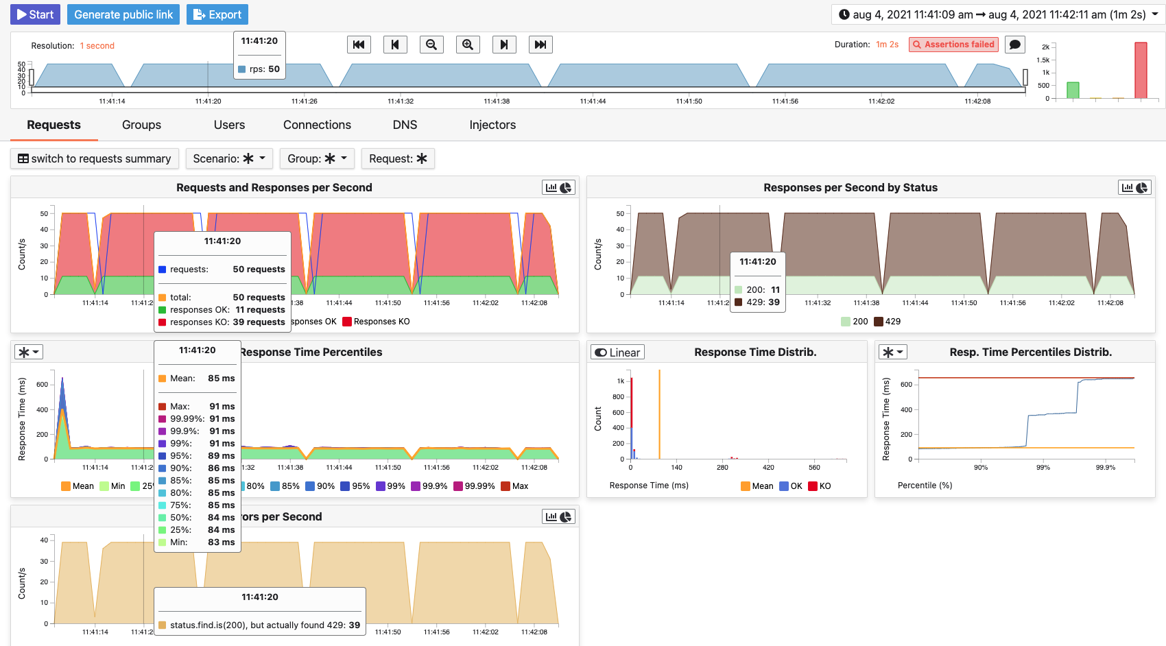
This view introduce all the metrics available for a specific run. This page consists of:
- The run bar
- The top navigator menu
- Assertions
- The timeline
- Tabs
- Filter bar
- Charts area
- The summary (only for requests and groups tabs)
- Public links
- Print to PDF
- Tips
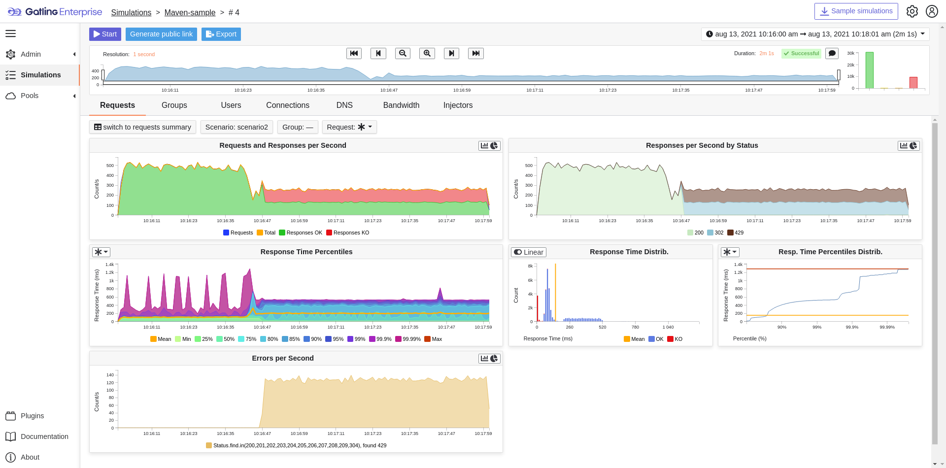
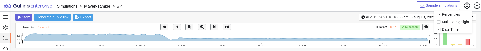
Run Bar
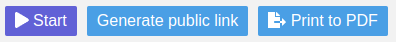
This bar is a combination of buttons:
- Start / Stop: Use this button to start a new run of the simulation, or stop the ongoing run (not available if you have a Viewer permission)
- Generate public link: To create a public link
- Print to PDF: To print reports
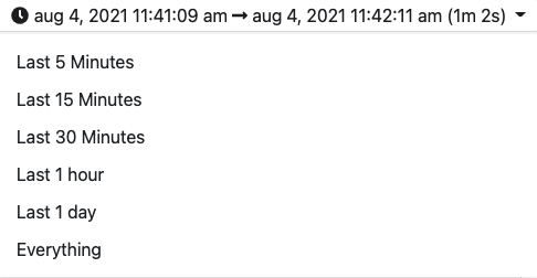
Top Navigator Menu
The navigation menu allows you to choose the simulation time range.
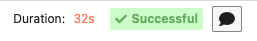
Assertions
The label below shows the status of the simulation (Ongoing, successful, timeout…). If your simulation has assertions, you can click this label. You can comment the run by clicking on the icon.
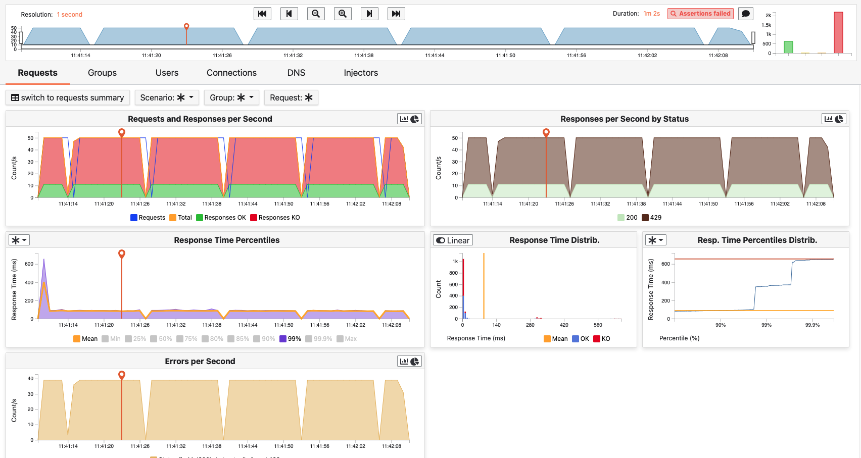
Timeline
The timeline contains metrics of the full run providing an overview of the run. Global information are available such as the resolution and the simulation name.
The resolution indicates the number of seconds per data point in the graph.
You can change the time range with control buttons or by selecting a region on the timeline:

Tabs
Below the navigator chart, there are tabs to switch charts. Each tab has the same structure except the summary that is available only for requests and groups tabs.

Filter Bar
This filter bar is a combination of buttons:
- Switch to Summary: Switch to summary view for Requests & Groups tabs
- buttons to filter the metrics drawn in the charts area

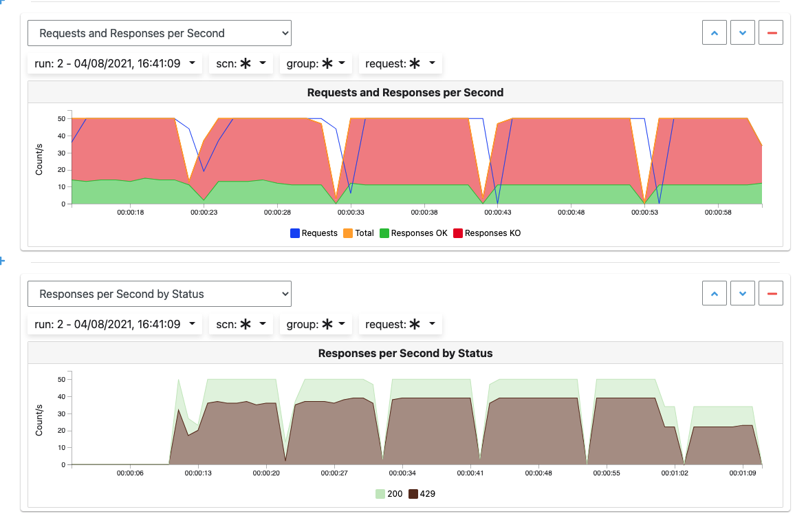
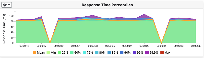
Charts
All charts in Gatling Enterprise are connected to each other, so if you select a time window on a chart it will automatically change it for all other charts. Metrics are drawn in multiple charts.
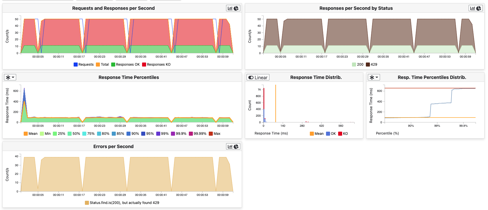
Some of them have an icon to update the chart settings:
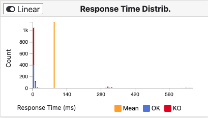
Moreover, histograms and pies are hidden behind each count chart, accessible by clicking their top right corner icon below.

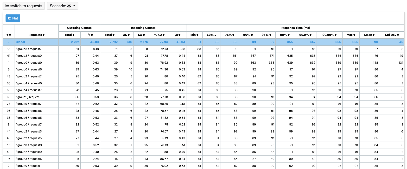
Summary (Requests and Groups only)
This view is available only from requests and groups tabs. It is a summary of metrics drawn in the charts, and has two modes: flat, by default, and hierarchy. The summary is also connected to the timeline and the time window selected, so if you change the time window the summary will refresh his data to match the time window.
On Flat mode you can filter the data by clicking any column name of the table.
Generate Public Links
A public link is a link of the current reports which will be accessible to anyone, without having to log-in to Gatling Enterprise. To generate a public link, click on the Generate public link button and choose the expiration date of your link.
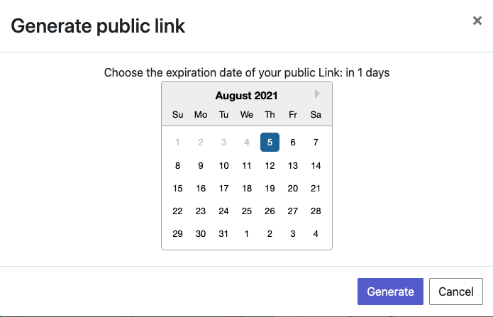
The maximum allowed lifetime for a public link is 1 year.
Choose an expiration date, then click the generate button.
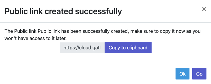
You can copy the public link to share your report to non-Gatling Enterprise users, or click on the “Go” Button to access it yourself. You can click on the “OK” button to close this modal.
Print to PDF
When clicking on the blue Print to PDF button in the navigator menu, you will have access to a page where you can configure and then print a PDF report of a specific simulation run.
This report is initialized with:
- a title element with the date of the run you were coming from
- the run status
- the run comments
- the run assertions
- the run requests summary
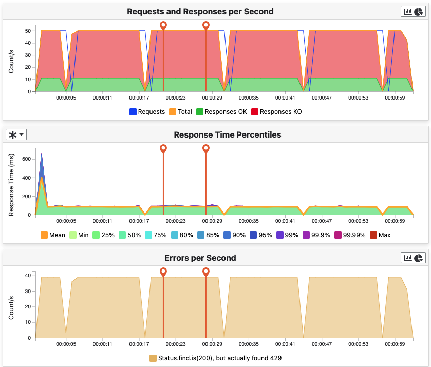
- 3 charts of the run:
- Requests and Responses per second
- Responses per Second by Status
- Response Time Percentiles
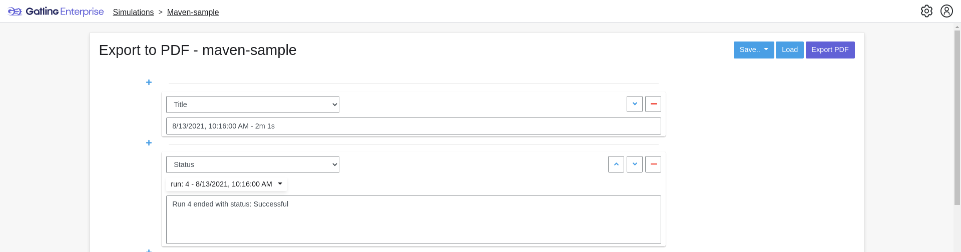
This page is a configurable list of different elements that will be displayed in the report. You can click on the blue add button under every element to add another one.
Every element can be moved up or down by clicking on the blue arrow on the top right of the element, or be removed by clicking on the red dash.
Those elements are composed of:
- Title: adds a title element.
- Text Area: adds an editable text element.
- New Page: allows you to skip a page in the report.
- Run:
- Status: adds an editable text element with a predefined text set to the status of the selected run.
- Comments: adds an editable text element with a predefined text set to the comments of the selected run.
- Assertions: adds a table with the assertions of the selected run.
- Summary: add sthe summary table of the selected run in a new landscape page.
- Chart: adds a chart element that you can interact with before exporting it to PDF.
- Counts: adds a count chart element that you can interact with before exporting it to PDF.
As you can see below, every chart (or other element) can be interacted with individually. You can zoom on it, or select the run, the scenario, the group, etc.. whose you want your data to be fetched. You do not need to have the same settings for each element.
After adding all desired elements in the report you can click on the Export PDF button on the top right to get your PDF file.
There are two more actions you can do:
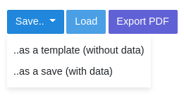
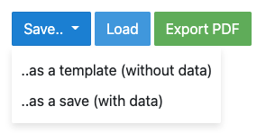
- Save: save the current Export configuration:
- as a template: this option will save the element list without the content
- as a save: this option will save everything, including the content of the Text Area and the configuration of the graphs
- Load: load a previously saved template or save.
Useful Tips
Zoom
You can reset zoom by a double click on a chart. It is possible to change the time range window by the following actions:
- Clicking zoom icons of the control buttons
- Select a zone in any charts and timeline
- Select a range time from the top navigation bar
Markers
To ease your analysis, you can create markers on all the charts by right clicking on them. And click on the top of the marker to delete it.
Multiple Highlights
In the top right menu, you can activate the Multiple Highlights setting which allows the tooltip to be displayed on every chart at the same time.
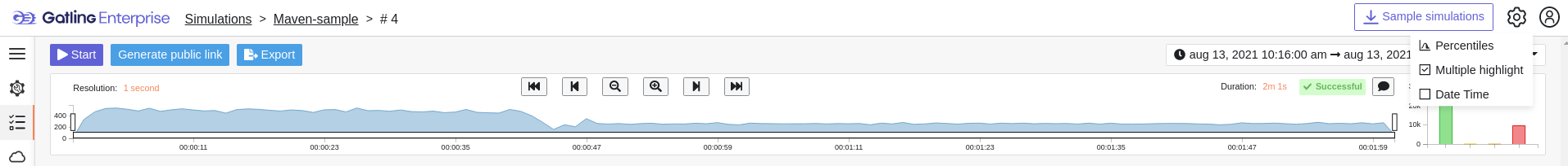
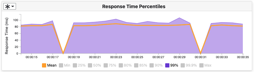
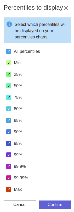
Percentiles Mask
In the top right menu, you can click on the Percentiles setting to be able to chose what percentiles to display in the chart.
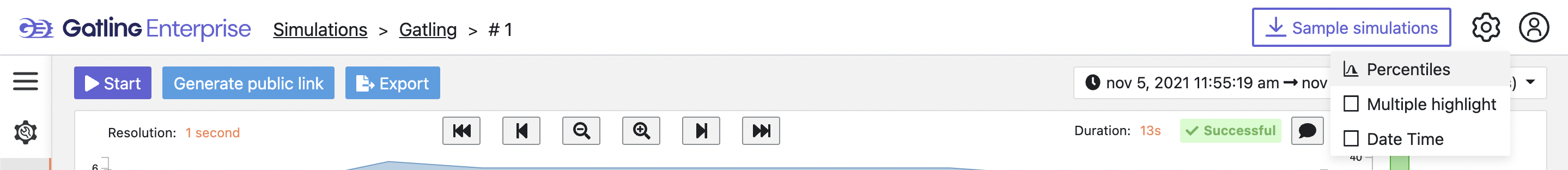
Date Time / Elapsed Time
In the top right menu, you can activate the Date Time setting to be able to switch from elapsed time to date time.
Highlight Legend
If you hover your mouse over a label on the percentiles chart legend, you will be able to highlight the curve on the chart, leading to a better view of that curve. The highlight legend option is enabled for every “non stacked” graph.